Green glorious green. It is a great colour for your home! It reminds us of the outdoors and helps build a connection between your outdoor space and your interior. Below we would like to show you some beautiful interiors of how different shades of green are used.

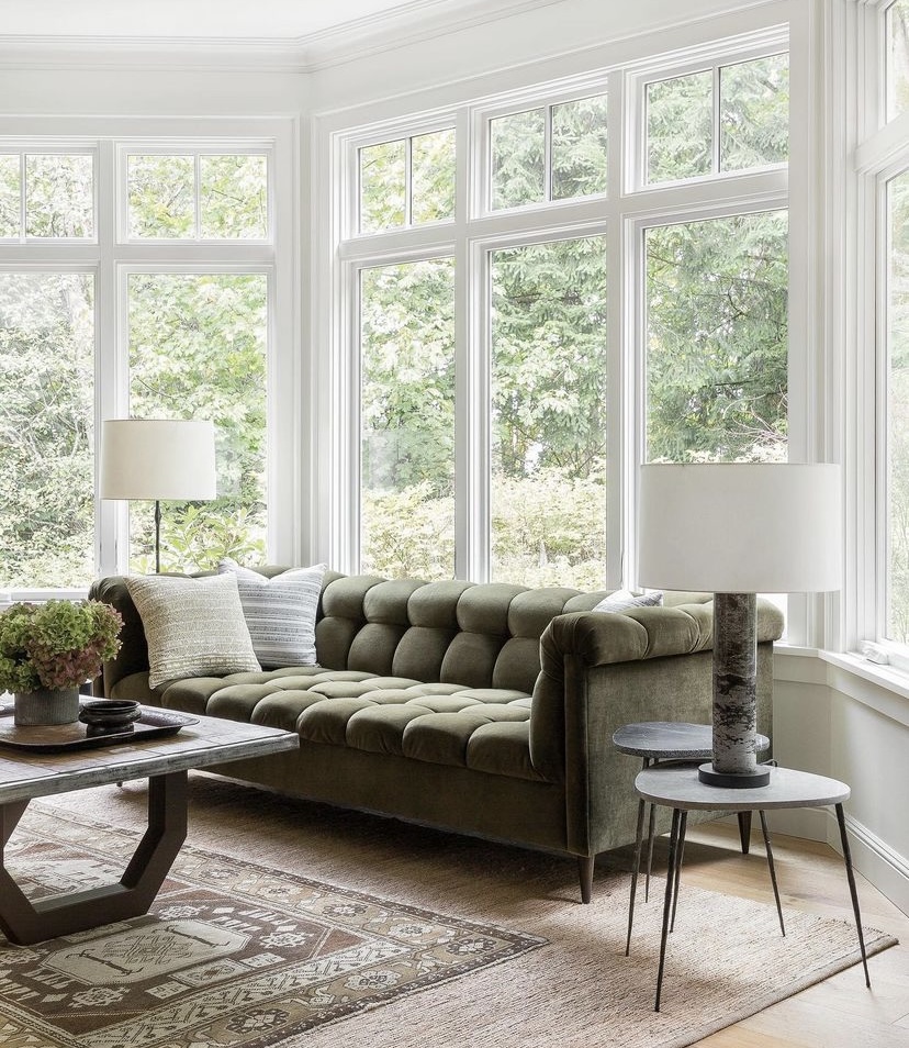
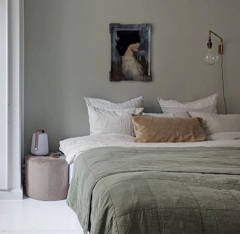
Olive Green
Olive greens have become popular accent colours more recently. It provides a heritage feel, but has an inviting warmth. It also makes a stunning backdrop for florals, foliage and patterns in a maximalist scheme.
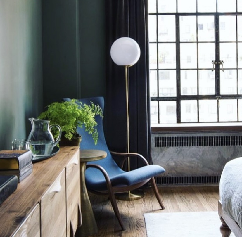
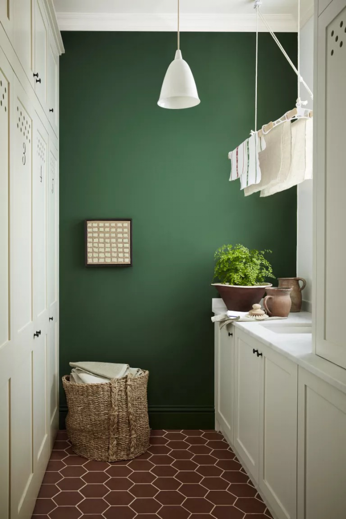
Dark green
In darker rooms, sometimes it’s best to embrace the darkness. Dark green paint colours are perfect for these spaces because they provide warmth in rooms with greyer or bluer light. Jewel tones are really versatile, matching with other furniture and fabric trends like greys and beiges and also pairs wonderfully with busy patterns.
Pale green
This shade of paint colour works well for bedrooms that are east facing. They have more light in the morning so greens look energising, and then in the evening provide a little more warmth. This colour also looks great on furniture.
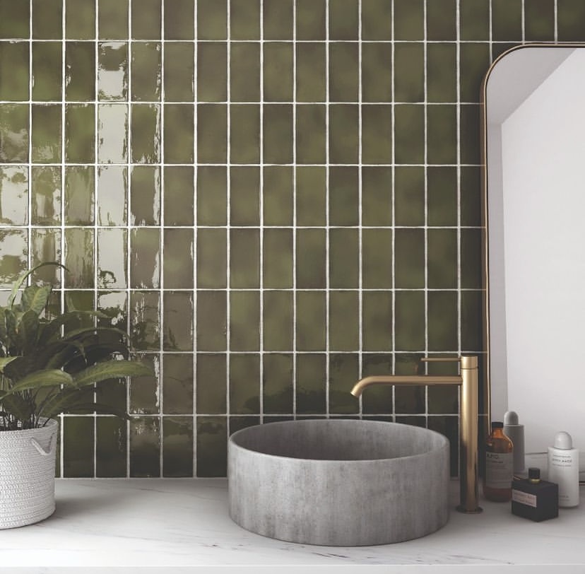
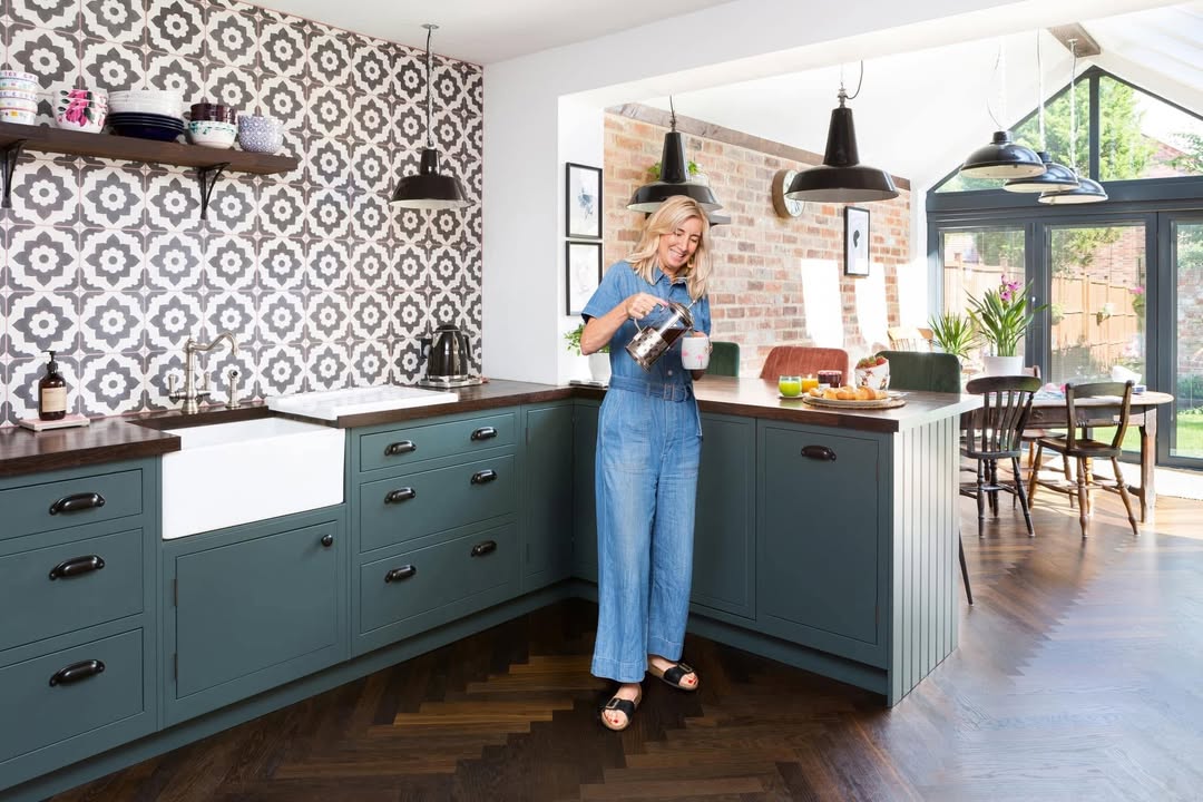
Grey green
Some of the best green paint colours have become so popular because they have a grey undertone that makes them restful and easy to use in the home. Grey green shades in kitchens provides a feeling of cleanliness without looking too cold.
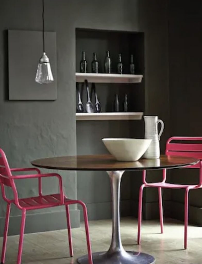
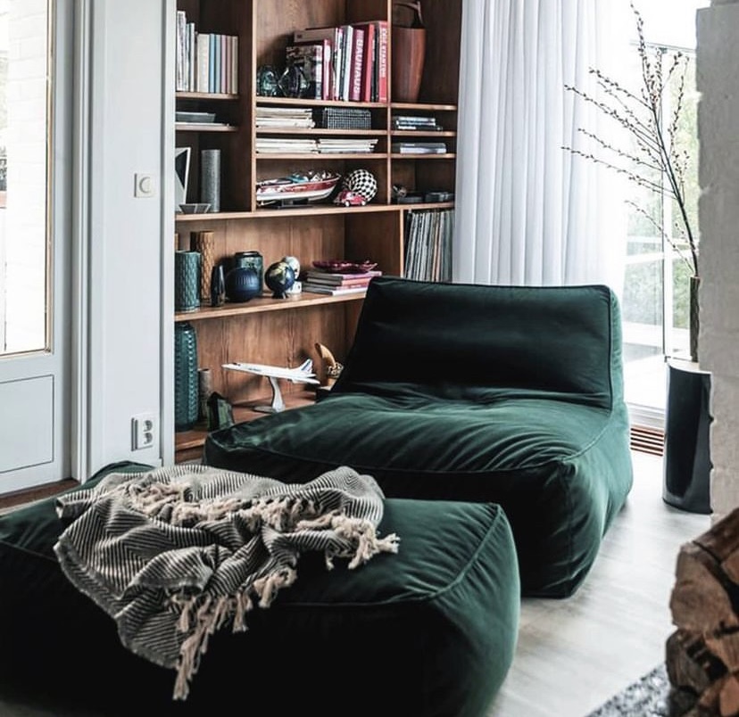
Forest green
Often the most difficult for people to figure out how to use, it is slightly cooler than olive and greyer tones. Keeping these colours in smaller spaces is ideal, creating density and excitement in rooms that would otherwise be white boxes.
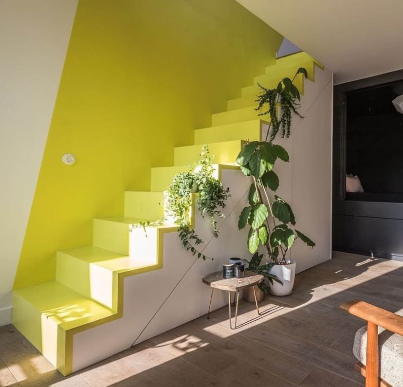
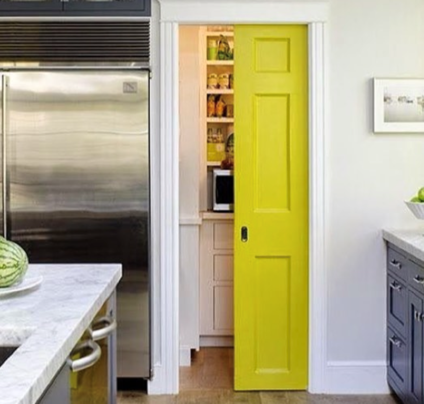
Chartreuse Green
One of the hottest trends for 2022 has been adding chartreuse accents to more neutral colour schemes. This electric green adds a vibrant pop of colour and can be soften with pink velvet upholstery and brass accents. Houseplants work well with this shade and it pairs nicely with rattan and light woods.


Leave a Reply