When it comes to decorating, colour isn’t just about what looks nice – it’s about how a space feels. The right palette can completely change your mood, helping your home become somewhere that restores, comforts and energises you when you need it most.
So, how can you use colour psychology in your own home?
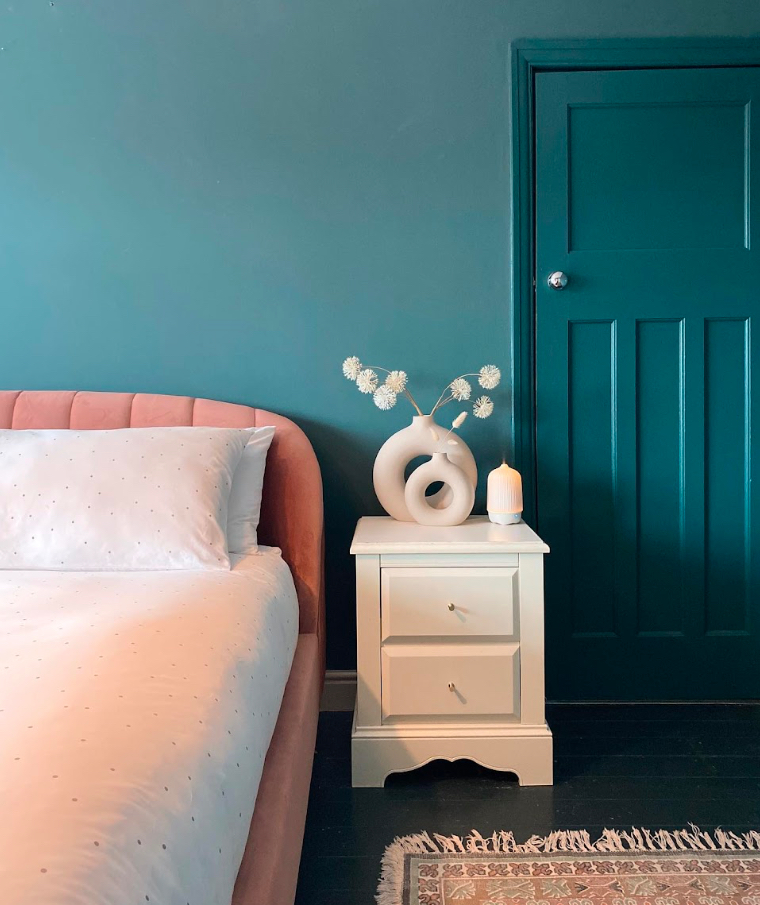
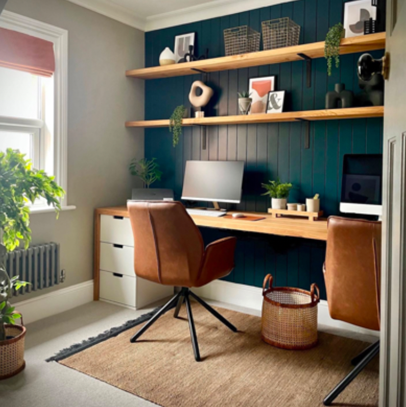
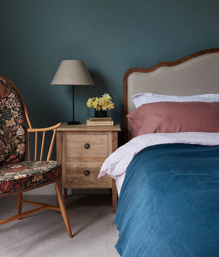
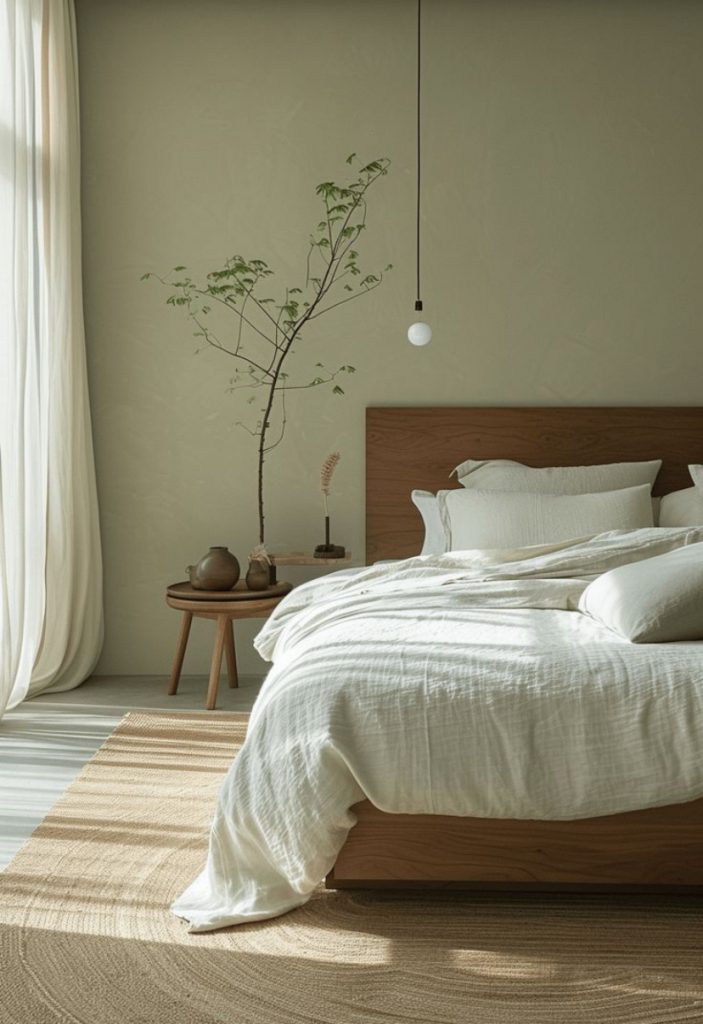
Blues & Teals – For Calm and Clarity
If you’re looking to create a sense of peace, blues and teals are your go-to. Deeper shades feel grounding and cocooning, while softer tones bring a gentle calm. Perfect for bedrooms or home offices where you want to relax or focus without distraction.
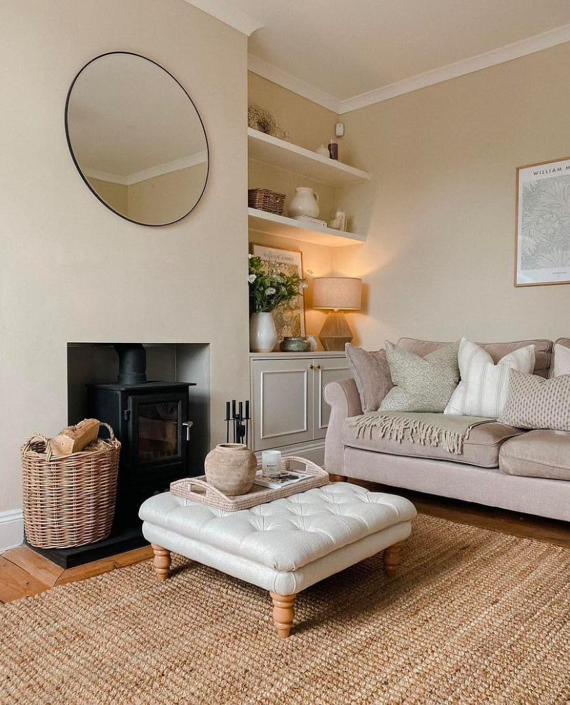
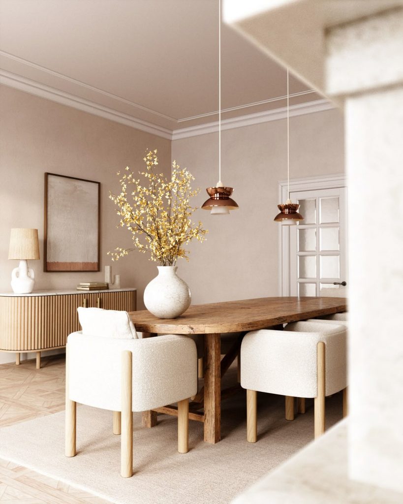
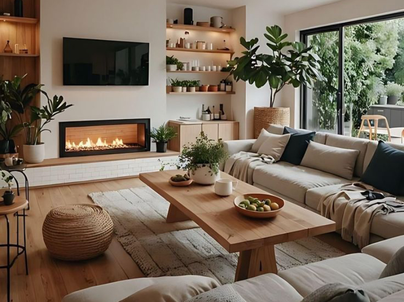
Warm Neutrals – For Comfort and Security
Warm whites, soft taupes and creamy neutrals have a nurturing quality. They make a space feel safe, welcoming and easy to live in – ideal for living rooms or open-plan areas where you want everyone to feel instantly at ease.

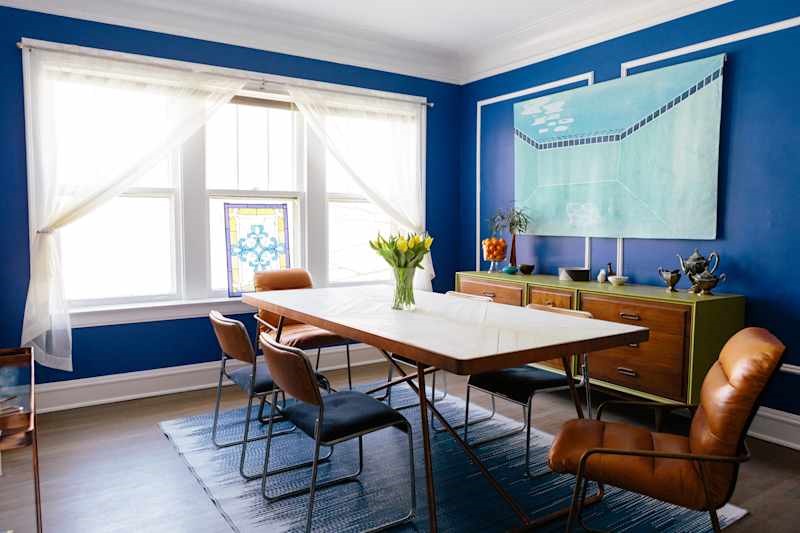
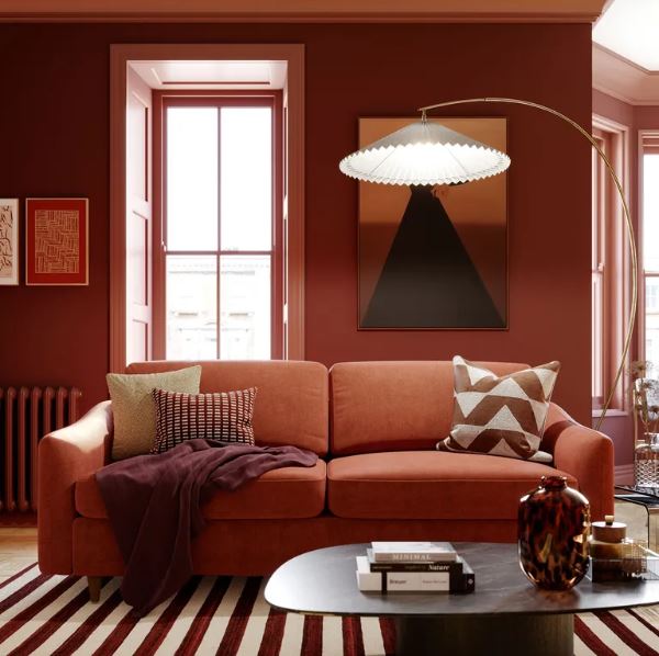
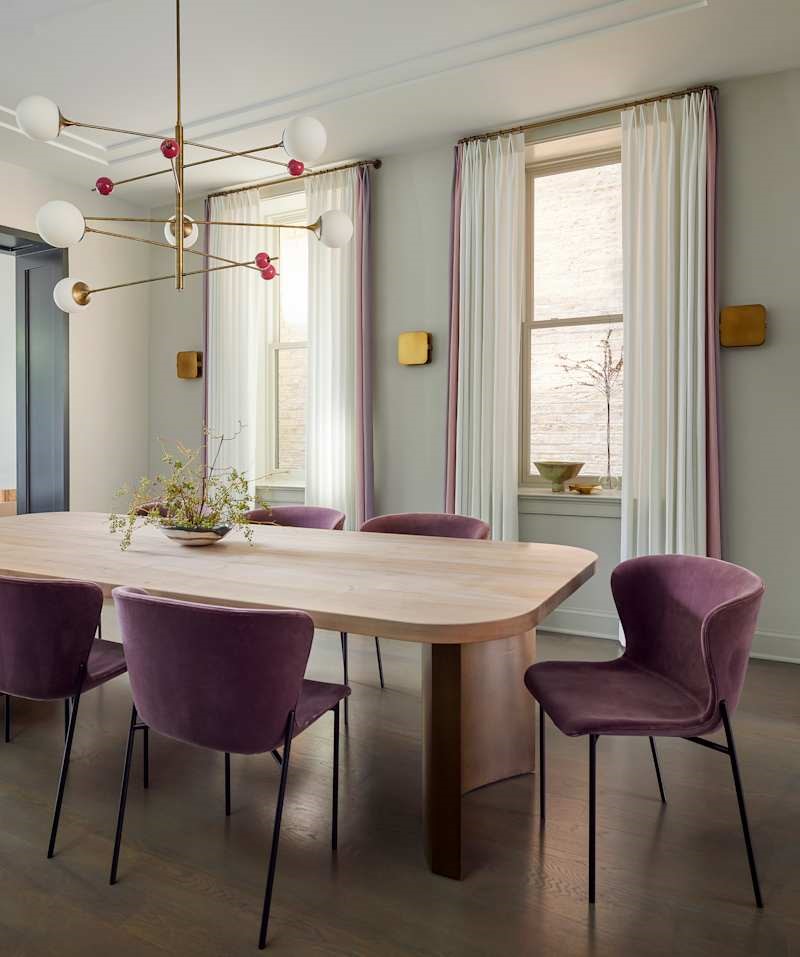
Jewel Tones – For Energy and Personality
Richer shades like plum, terracotta and burnt orange can lift a space and bring a sense of confidence and warmth. Used thoughtfully, they add depth and character – lovely in dining rooms or smaller spaces where you can be a bit braver.
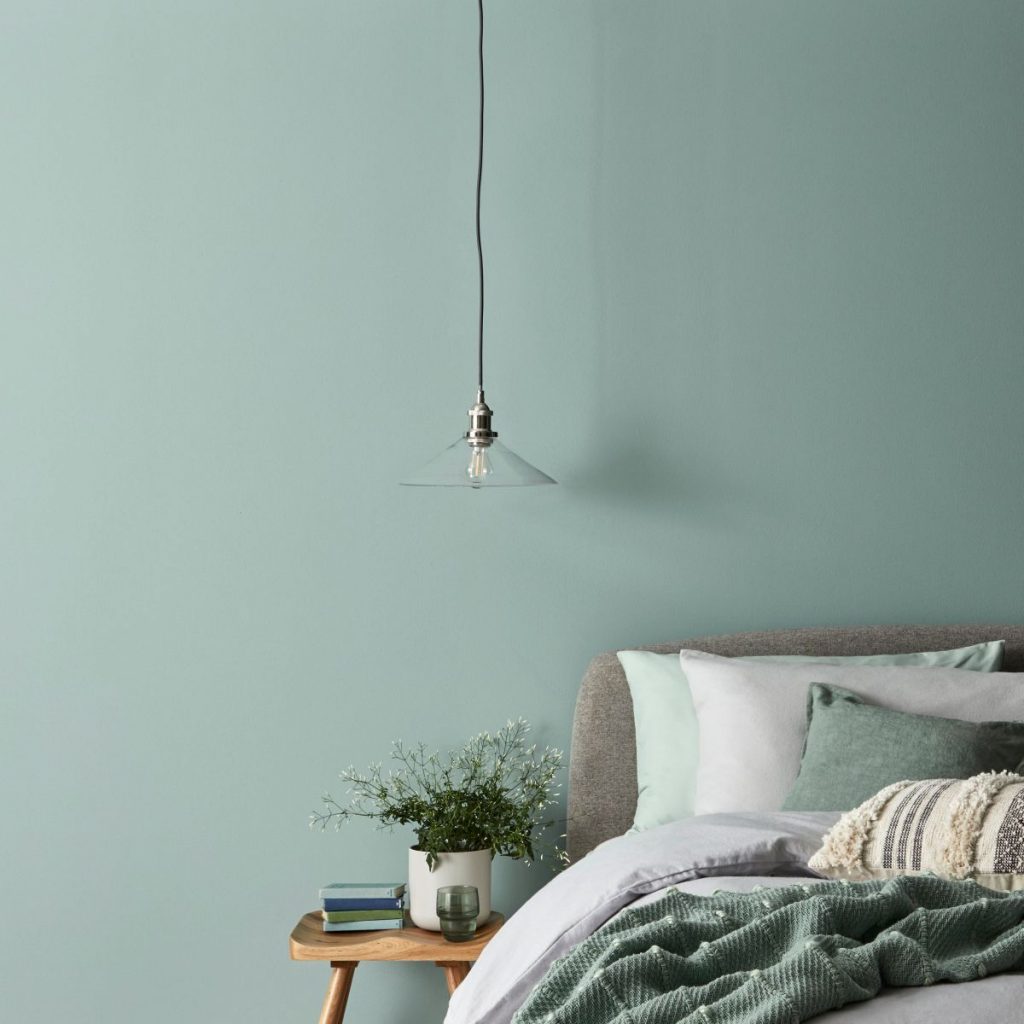
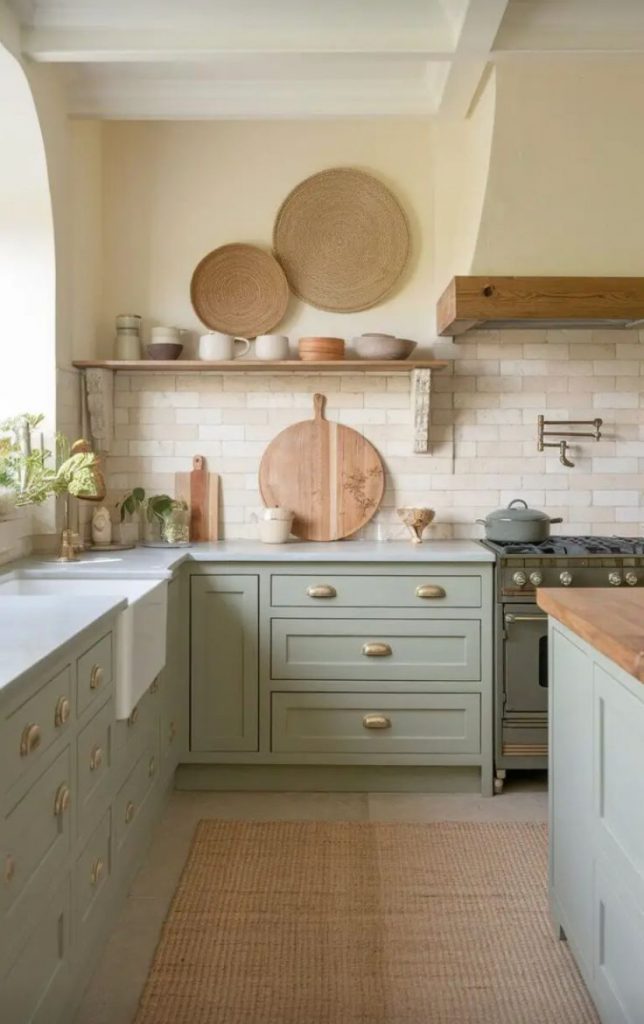
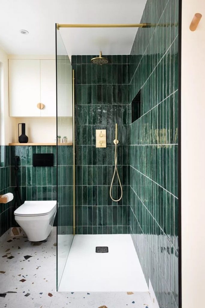
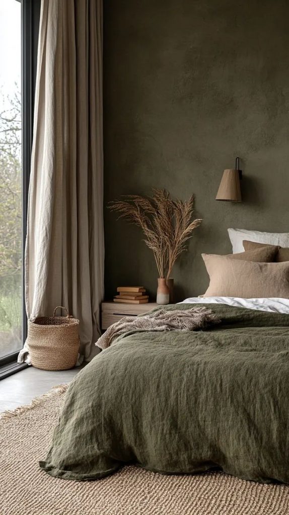
Greens – For Balance and Connection
Green is one of the most restful colours for the eye. From soft sage to deeper, moodier tones, it connects us to nature and promotes a sense of balance. It works beautifully in kitchens and bathrooms, where a calm, fresh feel is key.

A little tip from us…
If you really want to lean into the feeling of a colour, try using it across walls, woodwork and ceilings. It creates a more immersive, cocooning effect – and can completely transform how a room feels.
At the end of the day, the best colour choices are the ones that make you feel good. Trust your instincts – your home should support your mood, not just follow a trend. And if you’d like a helping hand bringing it all together, our interior design service is here to create a scheme that feels just right for you and your home.


Leave a Reply